Design and pages
Theme: colors, fonts, dark mode
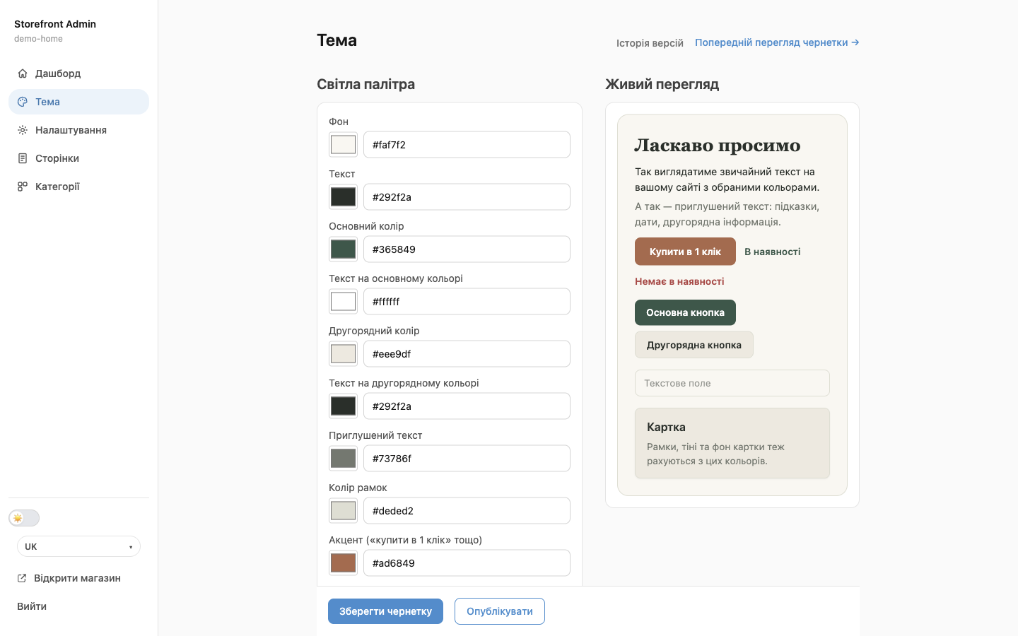
The Theme section sets the colors and fonts for your whole site: buttons, text, header, and product cards. The Live preview block on the right shows the result instantly, even before you save.
How to change colors
- Open the site editor (Edit website) → Theme.
- In the Light palette section, click a color square and pick a color, or type a color code, for example
#365849. - Check the result in Live preview.
- Click Save draft, check the site with Preview draft →, and click Publish.
What each color means
| Color | Where it's used |
|---|---|
| “Background” | Page background |
| “Text” | Body text and headings |
| “Primary color” | Buttons, links, header and footer (if selected in settings): your main brand color |
| “Text on primary color” | Text on buttons and in the header. It must be easy to read on the primary color, usually white or very dark |
| “Secondary color” and “Text on secondary color” | Secondary buttons, cards, section backgrounds |
| “Muted text” | Hints, dates, secondary information |
| “Border color” | Field and card borders, dividers |
| “Accent” | The “Buy in 1 click” button and other accents |
| “Success” | Price, “In stock” |
| “Danger” | Errors, “Out of stock”, “Running low!” |
💡 The header and footer color (primary color or neutral background) is set in Settings → Header/footer color.
Fonts and text size
- Font (font-family) is the body text font, and Heading font is for headings. Options: “System”, “Classic (Helvetica/Arial)”, “Friendly (Trebuchet/Verdana)”, “Rounded (Tahoma)”, “Serif (Georgia)”, “Typewriter (Courier)”.
- Base text size: for example,
16px. - Heading scale ratio: how much larger headings are than text, for example
1.25. A bigger number means bigger headings.
💡 Only fonts from the list are available, so they look the same on every device. You can't upload your own font yet.
Dark mode
You can let visitors choose between a light and a dark look for the site.
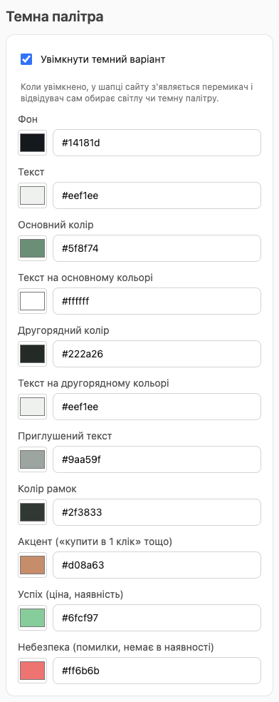
- In the Dark palette section, turn on Enable dark variant.
- The same colors appear for the dark variant. Set them up and check the Dark tab in the live preview.
- Save and publish. A ☀️/🌙 switch appears in the site header: visitors choose the look themselves, and the browser remembers it.
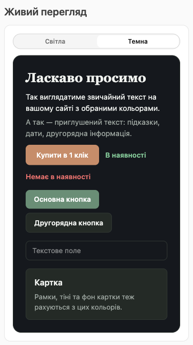
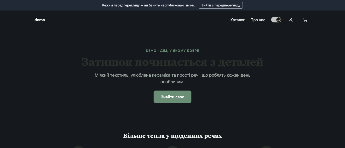
⚠️ If a banner block has its own Text color, it doesn't change in dark mode, so dark text on a dark background becomes invisible (as in the screenshot above). For sites with dark mode, set the banner text color to Auto or check both variants in the preview.